.png)
Martini Girls Club Site Design
Designing an empowering platform where ambitious women can find community, events, and inspiration.
Role:
Lead UX Designer
Team:
3 UX Designers
Timeline:
Jan-May 2025 (5 Months)
Project Overview:
Martini Girls Club is a New York–based social club for ambitious women seeking connection, curated events, and career growth. In January 2025, the founder came to us with a vision and a need for a website that could bring that vision to life. With no existing platform, we designed everything from the ground up: defining the site’s structure, content, and experience based on her goals and user needs. This case study walks through how we brought that vision to life through research, strategy, and design.
.png)

Design Strategy
Discover & Research

Define the Problem

Design and Iterate

Results & IMpact

Research & Insights
Competitive Analysis: Understanding The Landscape
To create a compelling and competitive experience for Martini Girls Club, we first needed to understand the existing landscape of social and networking clubs. We analyzed six key competitors and were able to identify where our competitors succeeded, and where they fell short.
The key insights we found were that:
-
Many platforms skew exclusive, lacking emotional warmth.
-
Hybrid access and curated support were rare but desired.
-
We positioned MGC to blend approachability with purpose-driven community.


Interviews
Before jumping into solutions, we wanted to hear directly from the women we were designing for. We spoke with 8 ambitious, early-career professionals. Women who were socially curious and open about what they craved (and avoided) in a social club.
Our 25-question script helped us get beyond what they wanted and into why it mattered. Underneath their answers were deeper emotional needs:
-
To feel seen
-
To feel safe
-
To find spaces where ambition doesn’t mean sacrificing joy or authenticity
What we explored:
-
What their dream club would feel like on day one
-
Emotional drivers like confidence, connection, and belonging
-
Frustrations with past spaces that felt cliquey, cold, or corporate
What we heard:
They weren’t looking for just another event space. They wanted somewhere to grow. Some had been to events that felt like cash grabs or made them feel like outsiders. Others lit up when talking about the magic of a great host or the comfort of walking into a room that felt welcoming, not competitive.
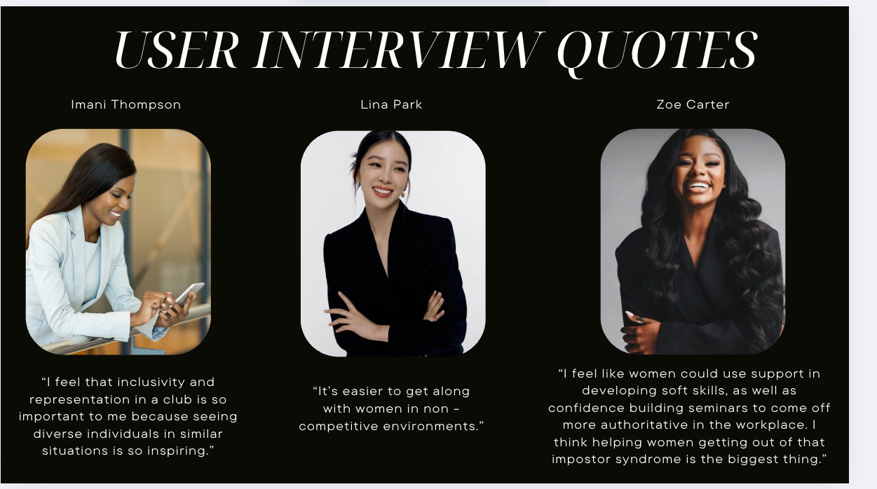
User Interview Quotes
These quotes come directly from the women we interviewed. Each one reinforcing the emotional and functional gaps in their current communities.

"I feel that inclusivity and representation in a club is so important to me because seeing diverse individuals in similar situations is so inspiring."

“It’s easier to get along with women in non - competitive environments.”

“I feel like women could use support in developing soft skills, as well as confidence-building seminars to come off more authoritative in the workplace. I think helping women get out of that impostor syndrome is the biggest thing.”

“I would love if the club provided access to mentors or leaders in my field—like people I wouldn’t otherwise meet.”
Research Takeaways
Women craved spaces that supported both personal and professional development

A strong preference emerged for curated, elevated environments that felt safe and inclusive
Most desired hybrid access to events and community features, not just in-person

Empathizing With the User
Persona
To stay grounded in the needs of real people, we created a primary persona: Jade. She’s a 30-year-old marketing specialist in NYC who’s ambitious, curious, and craving community.
Jade reminded us that success shouldn’t come at the cost of authenticity. She wanted more than just events. She wanted spaces that felt warm, safe, and real. Her perspective helped us focus on building a platform that blends connection, growth, and a genuine sense of belonging.
.jpg)
How Might We

design an intuitive platform that makes discovering and joining a social club seamless and enjoyable?
How Might We

Ensure the website reflects the inclusive and supportive values of the Martini Girls Club?
How Might We

Make it easy for users to explore subgroups, communicate with members, and RSVP to events through the website?
Defining the Problem
Problem Statement
Jade needs a hybrid platform that fosters genuine connections, offers diverse events (both virtual and in-person), and provides personal and professional development opportunities in a safe, judgment-free environment.
Goals & Strategy
After aligning with the stakeholders, we focused on 3 core design objectives:
1. Create a warm, intuitive hub that reflects community-first values
2. Showcase member benefits clearly to attract new signups

3. Support diverse journeys through events, subgroups, and content discovery

We began by building a shared style guide and moodboard to unify our visual language across pages. Our initial color palette reflected richness and femininity, but after a working session with the founder, we received important feedback: the palette felt overly complex and didn’t align with her brand vision.
In response, we simplified to a refined palette grounded in deep greens and neutrals — colors the client felt best represented the Martini Girls Club brand. This pivot became the foundation for our updated components, typography styles, and page layouts.
Design &Iteration

.png)
Bringing the Brand to Life
As we moved into design, our goal was to translate everything we learned into a brand that felt welcoming, purposeful, and distinctly Martini Girls Club.
Working closely with the founder, we aligned on a visual direction that felt elegant, modern, and community-first. I focused on the Events and Education Hub pages, two key spaces for member engagement.
Visual Direction
The founder envisioned something elegant, modern, and community-first. Our moodboard blended the energy of nightlife with the warmth of sisterhood to guide our visual tone.
Color Palette Refinement
We started broad, then refined the palette to deep greens, neutrals, and rich accents that better reflected the club’s identity.
Exploring the Design System
We developed layout, typography, and navigation options to support clarity and cohesion. This included multiple header and footer designs, which we’ll refine further based on the founder’s feedback once all pages are complete.
Current Status
We're in the process of building and migrating the full experience into Squarespace ensuring that the final site doesn’t just look good, but reflects the values of the brand.
Events Page
Quick Overview:
I led the design of the Events Page, a key space for showcasing upcoming gatherings, encouraging RSVPs, and expressing the club’s vibe.
Design Goals:
-
Make browsing feel curated, not transactional
-
Show key details (title, date, location) at a glance
-
Encourage RSVP with minimal friction
Low Fidelity Wireframe

Layout Explorations
To find the right balance of warmth and usability, I tested a range of layout styles including vertical lists, grid cards, and visual timelines. Each explored different ways to present event info clearly while maintaining a polished, community-first feel. I shared these concepts with the founder for feedback.

Grid Layout

Card Layout

Mood-Driven Hero Design
Selected Design

Timeline Scroll Layout
Final Iterations from Selected Design
These high-fidelity iterations carry forward the selected direction designed to feel clean, welcoming, and aligned with the club’s identity.
Refinements I made
-
Improved card hierarchy for better scannability
-
Adjusted button placement to streamline RSVP flow
-
Refined spacing and padding for a cleaner visual rhythm
-
Updated typography for clarity and cohesion
-
Enhanced visual balance between imagery and text
-
Simplified filters to reduce cognitive load
Current Status
The final layout is being prepared for Squarespace implementation alongside other core pages.
First Iteration

Second Iteration

This page was all about making career resources feel easy to explore and actually inspiring to dive into.
I organized the content into clear, scrollable sections so members could find what they needed without feeling overwhelmed. The tricky part was striking a balance between depth and clarity. To solve that, I used structured blocks and cut down on visual clutter, while still letting the imagery bring the page to life.
After testing a few directions, we landed on the version you see on the right. It felt cleaner, easier to navigate, and more aligned with the energy of the club.
Education Hub
Initial Concept

Final Direction

Collaboration Across Pages
While I focused on the Events Page and Education Hub, I stayed closely involved in team design reviews offering feedback on shared components and contributing to the Home, About, Membership, and Community pages. Our open critique sessions helped us stay aligned and create a consistent experience across the site.
What's Next
We’re putting the finishing touches on final screens and prepping for usability testing to make sure everything flows clearly and intuitively. After that, we’ll migrate the designs into Squarespace and start building the live site.
Reflection
This project pushed me to grow as a designer who leads with both heart and clarity.
I learned how to translate big-picture ideas into flows that made sense to users
-
I practiced designing within MVP constraints without sacrificing warmth or polish
-
And I got more comfortable guiding design strategy and telling the story behind my work
-
Got comfortable designing with minimal input shaping both the experience and the content when details were still undefined